Make your app's rulebook and teach it to Claude
<you-will-learn>
- The 7 parts of every app rulebook
- Making yours from screenshots, one step at a time
- Checking it on one page, then installing it in Claude
- Testing it and fixing what's missing
In Lesson 1 we learned the big idea: write your app's rules down once, and Claude follows them forever. Today you make that rulebook. Grab your my-app-screens folder from the Level 0 side quest.
What goes in a rulebook?
Think of it like the instructions in a LEGO box. Seven parts:
| Part | What it means | Everyday example |
|---|---|---|
| 1. Colours | Which colour does which job | “Main buttons are dark green. Background is cream.” |
| 2. Text | Fonts and sizes for titles, normal words and small notes | “Titles are 24, bold. Notes are 13, grey.” |
| 3. Spacing | How much empty room goes around things | “Always 16 between cards, 20 at the screen edge.” |
| 4. Pieces | What buttons, cards, lists look like — in every state | “Buttons are full width; grey when disabled.” |
| 5. Voice | How the app talks | “Say ‘Add money’, not ‘Initiate transfer’.” |
| 6. Never list | Things your app never does | “Never purple. Never fake text.” |
| 7. Self-check | A checklist Claude runs before showing you anything | “Did I only use our colours?” |
No app yet? Start from references
Building something brand new, with no screens to screenshot? Don't invent a style from nothing — that's exactly how generic AI UI happens. Borrow on purpose instead:
- Pick 4–6 apps or sites you love. Good free places to look: Mobbin (real app screens), Refero, Pinterest, Dribbble.
- Write one thing you like about each. Be specific: “the calm cream background”, “the big bold numbers”, “the chunky black buttons”.
- Ask Claude to remix them into one system (below). Then continue from Step 1 with the result instead of screenshots.
I don't have a design system — start from references and Brand-to-Skill runs this for you.Step 0 — Start a project (2 minutes)
In Claude, create a Project called “[Your app] design system” and upload your screenshots to it. A project keeps files and chats together, so you don't have to re-upload every time.
Then open a new chat inside the project and type:
What you should see: a description of your app and a list of open questions (for example “I can't see a disabled button”). That list is gold — those are the gaps generic AI fills with guesses.
Step 1 — Give every colour a job
“Green” tells Claude nothing about when to use it. “Main button colour” does.
#0F3D2E (a dark green). Computers use it to get exactly the right colour.color-action-primary instead of “green”. Names help Claude pick the right one every time.Check it: are any two colours almost the same? Merge them. Is there a colour with no job? Remove it. Fewer colours, each with one job, is the secret.
Step 2 — Text sizes
What you should see: a small table with six rows. If your app uses a custom font you can't name, say “use Inter as a stand-in” — it's free and close to most app fonts.
Step 3 — Measure the breathing room
Most AI designs feel “almost right” because the spacing is off, not the colours.
Step 4 — Describe your 5 most-used pieces
Usually: a button, a text box, a card, a list row, and one piece special to your app (a price tag, a progress bar, a seat).
Step 5 — Voice: how your app talks
Step 6 — Write your Never list
This is the secret weapon against boring AI looks. Start with these and add your own:
- Never use a colour that isn't a token
- Never add gradients or shadows unless the app has them
- Never write “Lorem ipsum” or fake names like “John Doe” — use realistic content
- Never put a card inside a card
- Never centre a page title unless the app does
- Never use more than one main button per screen
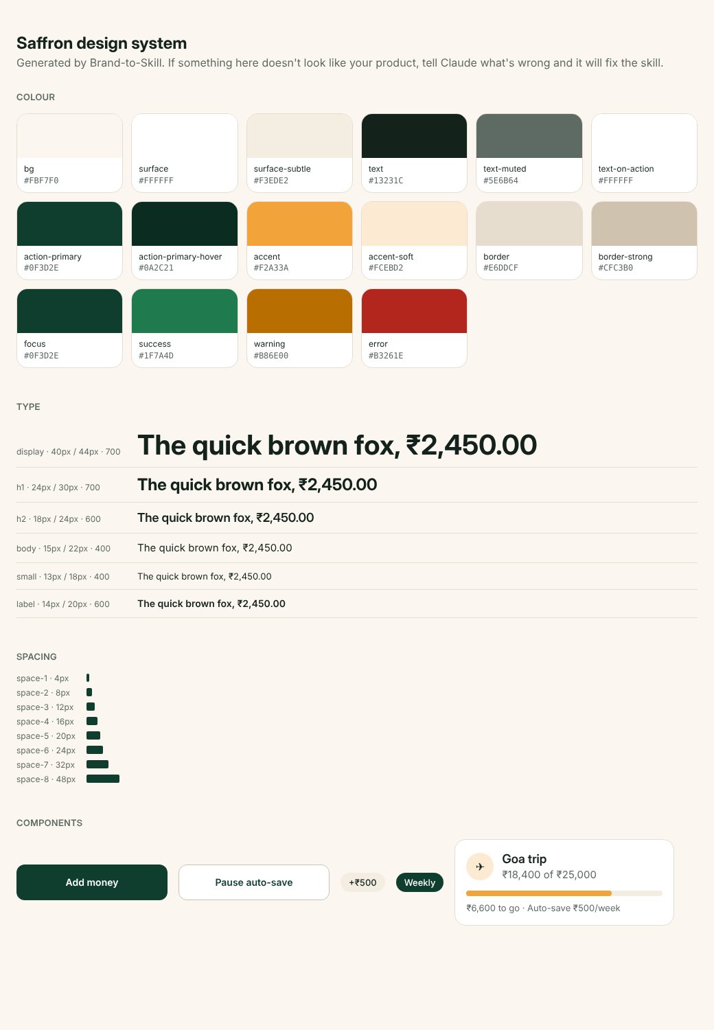
Step 7 — Look at it all on one page
Put it next to your real screenshots. Does it feel like your app? If something's off, don't fix the page — fix the rule: “The main green is too bright, use #0F3D2E.”
Step 8 — Turn it into a skill and install it
Then install it:
- Claude website or app: Settings → Capabilities (or Skills) → Upload skill → pick the zip. Make sure it's switched on.
- Claude Code (for people who code): unzip it into
~/.claude/skills/.
Menu names change as Claude updates. If you can't find Skills, search “skills” in Claude's help centre.
Step 9 — The real test
Open a brand-new chat (not inside the project) and type one line:
What you should see: a screen that looks like your app, with no other instructions. If it does — congratulations, that's the whole trick working.
How the rulebook grows
Write every new rule as one sentence + the reason + the date:
The reason matters more than the rule. When Claude meets a case nobody wrote down, the reason is what it thinks from. And the date tells you which rules are old enough to question.
Your rulebook is never finished, and that's good. Every time you correct Claude, ask yourself: “will this happen again?” If yes, turn it into a rule. After a few weeks your rulebook will know your app better than any written style guide — because every mistake made it better.
Set up my design system for <my app> and drop in your screenshots. Brand-to-Skill runs Steps 1–9, asks you a few easy questions in one go, builds the skill, the tokens file and the specimen page, and tests it on a real screen.- My rulebook has colours with jobs, text sizes, spacing, 5 components, voice and a Never list
- I've seen it all on one specimen page
- It's installed as a skill and switched on
- In a new chat, “design the settings screen” looks like my app
Side quest
Ask for three different screens in three new chats: a list, a form and a profile page. For each, note one thing that's wrong and turn it into a rule. Three rules added = your rulebook is already better than yesterday.